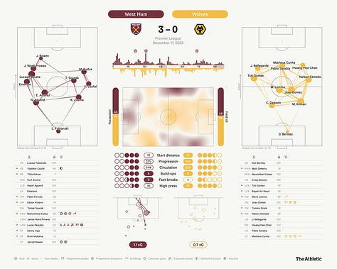
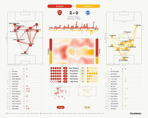
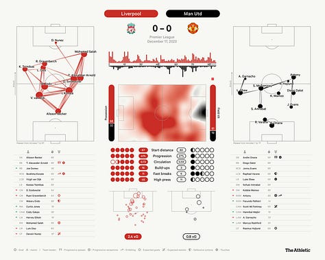
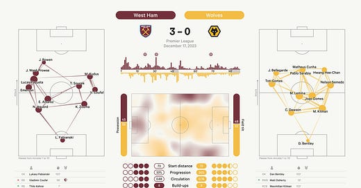
Been working on a new match dashboard viz for The Athletic that debuted just in time for the hectic holiday schedule. I wrote an explainer on how it all works, but I hope most of this stuff is intuitive enough for readers who don’t want to get into the details.
The design will likely evolve as we use these more, so please send me any ideas you have for how to improve it. In the meantime … aren’t they pretty to look at?


Hope you all have a great holiday season. See you in the new year.


Hi John, I commented on the athletic article too - I should have said, these look great overall! Looking at this set my eye immediately goes to the territory map, then to the stat dots below that. At least for me the design tells me these are the most important parts of the dashboard - they're centred, and they're the most colourful. My videogame-trained brain is also drawn to these dots as they kinda look like acceleration/top speed/handling or similar stats in games. More dots = better.
Comparing these dots - especially the Everton and Fulham games - I wonder if there is any way for the data to show "Effective Dycheness"? I've not watched the game back but I assume it was never in doubt that Everton would win. On all these key stats though it looks like Burnley was superior, in a similar way that it looks like Newcastle dominated Fulham. Dyche is clearly doing something right at the moment but it might be difficult/impossible to show with on-ball data.
One more small point - on the momentum chart for Fulham, the red card indicator is closer to the territory map than the threat bars, it took me a minute to figure out what it was. I am guessing this position is set by the max length of the bars on either side? Could it be brought closer for the less threatening team?
Love the dashboard, John! There's a small thing that I'd like to add, which is a note to indicate that the size of the player's dot on the passing network increases by the level of xT that the player contributes (I assume?), just for clarity and nothing else :)